How Mediterranean Island Light Affects Wall Art Colors
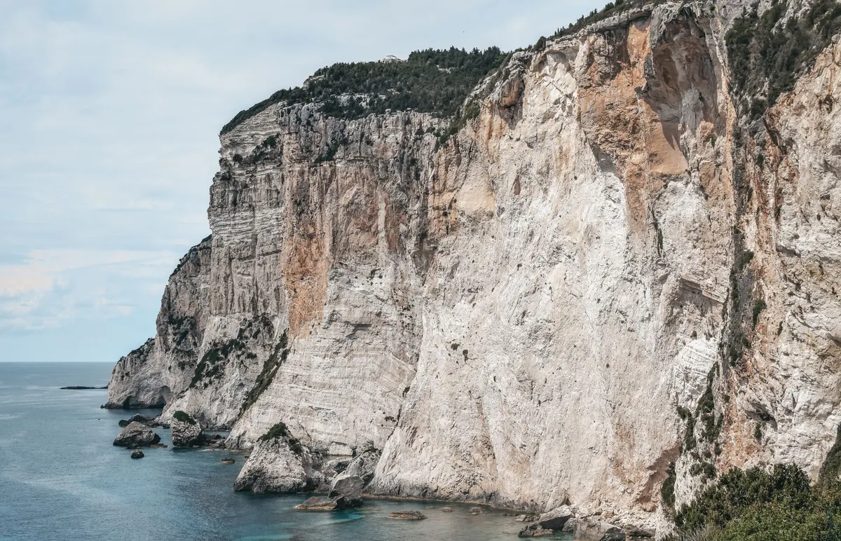
Walk into the same room on Lipari at nine in the morning and again at six in the evening, and the painting above the sofa will seem to have changed its mind. The blues go from soft to sharp. The whites flare and then settle. A terracotta accent that looked calm at breakfast can feel almost loud by siesta. This is not imagination. Island light is unusually strong, unusually reflective, and it arrives from several directions at once — off the water, off pale stone, off whitewashed walls and tiled floors. Art chosen in a dim city flat or on a phone screen often behaves differently once it is on an island wall.
The good news is that this is manageable. Once you understand what the light is doing, choosing blues, whites and warm tones for a coastal room becomes a series of small, sensible decisions rather than a gamble.
What Island Light Actually Does to Colour
Mediterranean light is bright for long stretches and relatively unfiltered. Shadows are crisp, highlights are strong, and the contrast between a sunlit wall and a shaded corner is much wider than in northern Europe. Your eye adjusts constantly, which means you tend to misjudge colour in the moment. A deep blue that reads as rich and moody in a shop can look almost electric in a room with three hours of direct sun. A pale wash that looks delicate can quietly disappear.
Then there is reflected light. In island rooms, colour rarely comes only from above. It bounces up from terracotta floors, in from the sea, sideways off a neighbouring whitewashed wall. Sea bounce is cool, slightly green-blue. Limestone and whitewash are warm and neutral. Tiled floors push a soft orange upward into the room. A painting that hangs near a window with a sea view is lit partly by the sea itself, and that cool underlight changes how its own colours read.
Practical upshot: judge a piece where it will hang, not where you bought it, and look at it at three points in the day — mid-morning, late afternoon and after dark with the lamps on.
Blues: The Colour That Changes Most
Blues are the most reactive family on an island wall. Highly saturated cobalt and ultramarine can vibrate against bright white plaster; by late morning they may dominate a whole room. That can be wonderful if you want it, and exhausting if you don't. At the other end, very pale sky blues placed near a window often look washed out or faintly grey, because the sea and sky outside are simply more vivid than the art.
Work in the middle. Mid-tone blues, muted navy, slate, faded indigo and blue-greens with visible texture tend to hold their character through the day. They have enough depth to survive glare and enough softness not to shout. If you love a strong cobalt, consider hanging it on a wall that receives indirect light, or give it a wide off-white mount so the colour has somewhere to breathe.
One more caution: matching art exactly to the sea is a moving target. Water shifts from steel grey to turquoise to almost black within an afternoon. Choose a blue that relates to the room's whites and woods rather than to the water on the day you buy.
Whites and Off-Whites: Where Glare Lives
A pure white canvas or paper in a bright room can behave like a small light source. It glares, and that glare flattens fine line work and delicate detail. White-on-white pieces — a common choice for airy coastal interiors — need shadow and texture to survive. Look for deckled edges, visible paper grain, layers of paint, or a frame that casts a thin shadow line.
Off-white, cream, warm white and soft grey-white usually sit more comfortably. With frames, a bright white surround against a whitewashed wall either vanishes or glares; a slightly warm or chalky white gives definition without hard edges. Thin natural wood or dark metal frames can give a piece a clear boundary in a room where everything else is pale.
Warm Tones: Ochre, Terracotta and Coral
Warm colours gain energy in island light, partly from the sun and partly from the warm bounce off floors and stone. Ochre, brick, saffron and coral that look gentle elsewhere can go bright at midday. In a room with terracotta tiles and a sunlit wall, an orange-heavy painting may merge into its surroundings rather than stand out.
Two ways forward. First, favour muted earth pigments — faded rose, dusty brick, mustard with a bit of grey in it — and let texture carry the warmth. Second, if you want the wall and the art to merge, treat it deliberately: a large, low-contrast piece in warm tones can make a sunlit wall feel like one continuous surface, which is often exactly right in a small room.
Do not forget the evening. Warm bulbs push oranges and reds further than daylight does. A painting that looks balanced at noon can feel hot under a 2700K lamp, so check it after dark before committing.
Matching Art to the Room's Light
Bright south- and west-facing rooms
These rooms get the strongest, longest light and the hardest shadows. Softer mid-tones, textured surfaces and matte finishes hold up best. Large pieces work well here because they can absorb the drama of the room instead of competing with it. Avoid high-gloss finishes that throw reflections back at you.
Cooler north- and east-facing rooms
Indirect light is gentler but cooler, and it can drain warmth from a painting. This is where stronger saturation earns its place: deep blues, forest greens, richer ochres. If a piece looks slightly dull here at noon, it will often look right in the evening.
Rooms with a big sea view
The view is the loudest thing on the wall, and it always wins. Quieter, more abstract or more textural pieces usually sit better beside it than a literal seascape, which invites comparison it cannot win.
A quick check before you commit:
- Look at the art against the actual wall colour, not against the shop's white.
- Note the floor tone — terracotta warms everything above it.
- View it at three times of day, plus once with lamps on.
- Stand back to the distance you will actually see it from, usually two to three metres.
- Ask whether you want the piece to stand out or settle in. Both are valid; just decide.
Glass, Frames and the Slow Work of Sun
Glazing turns into a mirror when light hits it from the side or from a window opposite. In bright island rooms this happens more often than you expect. Anti-reflective glazing helps, and so does hanging a piece out of the direct path of a window. Canvas and board can often go without glass, which removes the problem entirely.
Sun is also patient. Pigments and papers fade over years on the sunniest wall, so keep favourite or older pieces on walls that receive indirect light, and ask for UV-filtering glazing where it matters. In coastal homes, avoid hanging work directly above a cooker or in a steamy bathroom, and leave a little air gap behind the frame so moisture does not sit against the wall.
Before You Hang: A Short Practical Check
Take a sample first. Cut a piece of card roughly the size of the artwork, paint or tape it in the colours of the piece, and pin it on the wall for a day. It sounds fussy; it takes ten minutes and saves a return.
- Confirm the wall's light at the hour you use the room most.
- Check the frame edge against the plaster — a thin shadow line helps in bright rooms.
- Hang at eye level for the room, not the ceiling height, and remember low furniture changes what "eye level" means.
- Leave breathing space: 15–20 cm on each side is a reasonable starting point for a medium piece.
- Live with it for a week before adding anything else nearby.
Island light is generous and slightly demanding. It rewards art with texture, mid-tone colour and a bit of restraint, and it punishes gloss and extremes. Choose for the room you actually have — its whitewash, its tiles, its hours of sun — and the colours will keep working long after the season ends.
Photo: Claudia Schmalz / Pexels